For comparisons sake, our current Component Library Documentation site can be found here: https://components.flexera.info/
Alongside developing a Component Library, it also needs to have heavily detailed documentation on every aspect of the library. This is so as anyone can read the documentation and make sense of it, regardless of their job role.
For Flexera, the main viewers of a documentation site may include:
- Team Obsidian, encompassed of Front End / UI Engineers
- New members to Team Obsidian at varying entry levels
- Other development teams within Flexera
- UX team
- ... and anyone else really! This is more relevant during this discovery phase as Flexera now have the intention of having a public facing design system, one which anyone from outside of the company can access
So to summarize, the reason for this discovery piece is to see how Team Obsidian can develop a public facing design system / component library that anyone can access and read.
As you will have seen in the introduction to this piece, we already have our own documentation site, so it's important to determine why a library like Storybook would be advantageous to us. Let's look at the the drawbacks of our current implementation.
Analysis of our current Documentation Site
In our ui-react-components repository, we have two main packages:
- ui-react-components - this is where we create our components
- ui-react-components-docs - this is where we manually create pages and routes for each component that we have created
The immediate conclusion here is that we should not have to maintain two separate packages for this, which is something Storybook can help us with. For each component that we create and update, we have to spend more time manually documenting said component. We want to completely remove this manual approach as it can lead to inconsistencies and errors. So how can Storybook help us?
Storybook Analysis

Firstly, what is Storybook?
Storybook is an open source tool for developing UI components and pages in isolation. It simplifies building, documenting, and testing UIs.
It makes development faster and easier by isolating components. This allows you to work on one component at a time. You can develop entire UIs without needing to start up a complex dev stack, force certain data into your database, or navigate around your application.
Here is a basic example of a story I created when doing a proof of concept for Web Components. Firstly, the file structure can vary, but the approach I had taken was to add stories per component folder. These can be scoped elsewhere, but for the sake of better isolation I preferred this structure.
All storybook files need a *stories.js extension - this is also configurable through Storybook if you wish to change the default query.
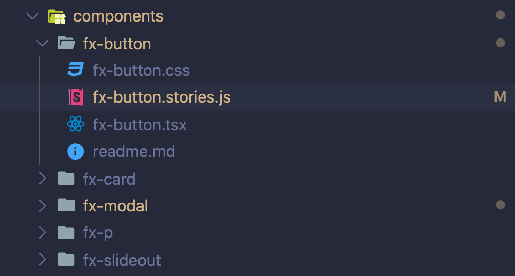
Inside the stories file for fx-button I created some basic exports per button theme: Primary, Secondary and Danger.
  // my-component.stories.js
  import readme from './readme.md';

  export default {
    title: 'Components/Button', // This renders a route of Components > Button
    parameters: {
      markdown: readme
    },
  };

  const ButtonTemplate = (theme) => `<fx-button theme="${theme}">${theme}</fx-button>`

  export const Primary = () => ButtonTemplate("primary")
  export const Secondary = () => ButtonTemplate("secondary")
  export const Danger = () => ButtonTemplate("danger")
And this renders out the below when we load Storybook in the browser. As you can see the Primary, Secondary and Danger buttons we defined previously have created a respective page.
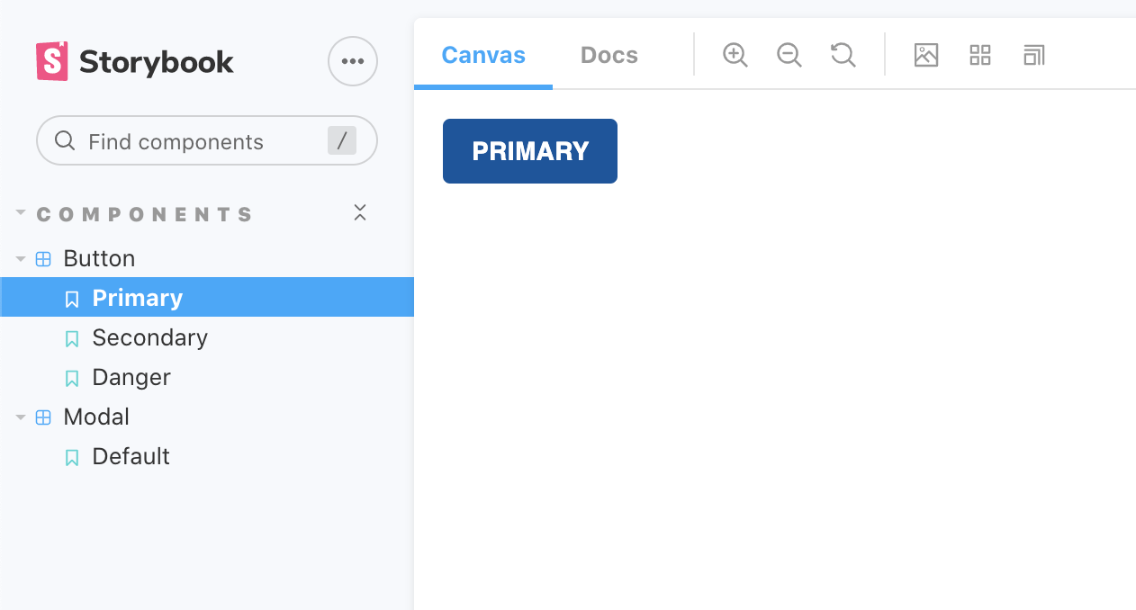
As you might have noticed, Storybook has a default appearance and theme out of the box, but this is easily changeable. For more information on adding custom themes to Storybook, check out their docs here: https://storybook.js.org/docs/react/configure/theming